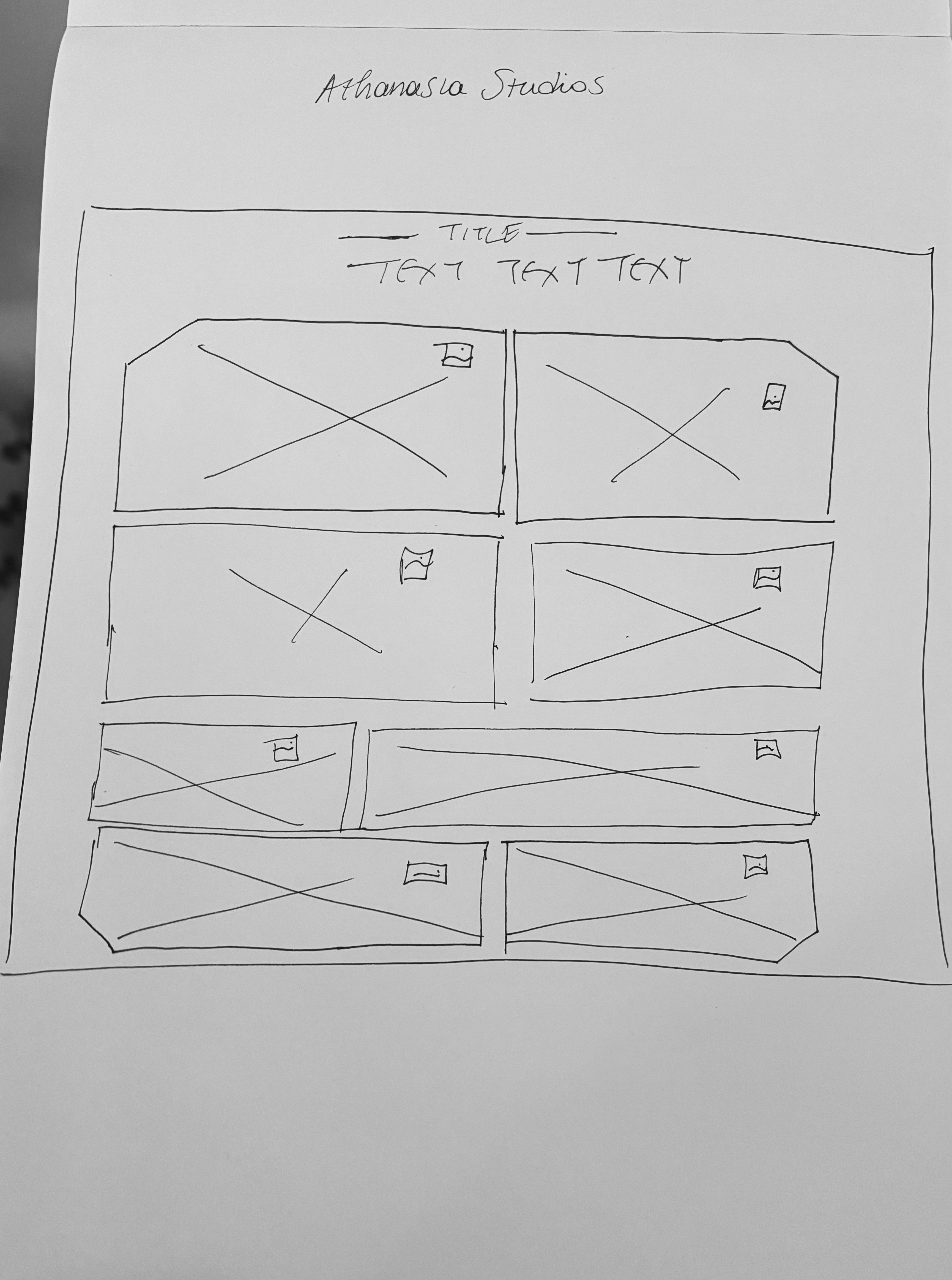
Athanasia Studios
Category:
Web Design / Logo Design
Client:
Athanasia Studios
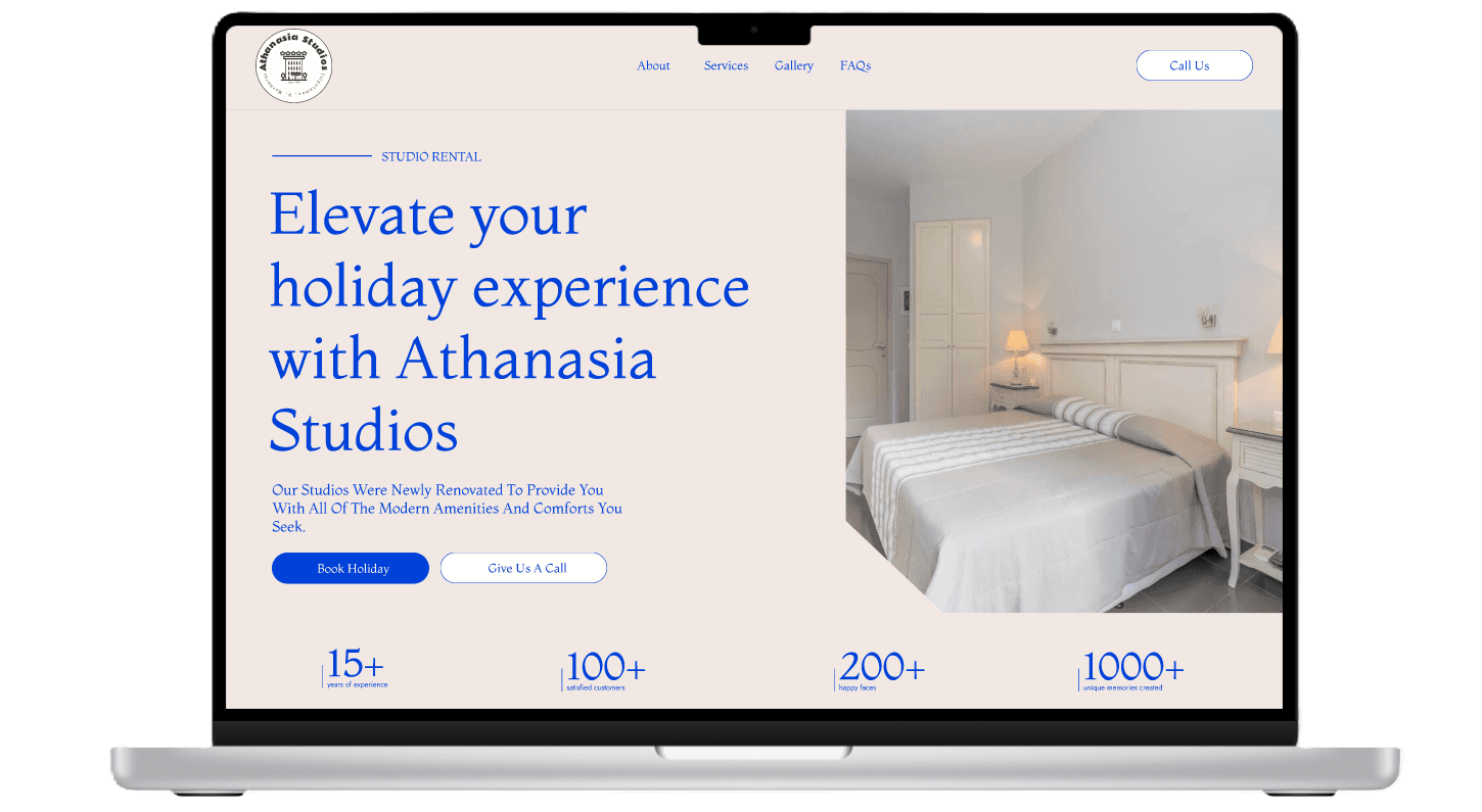
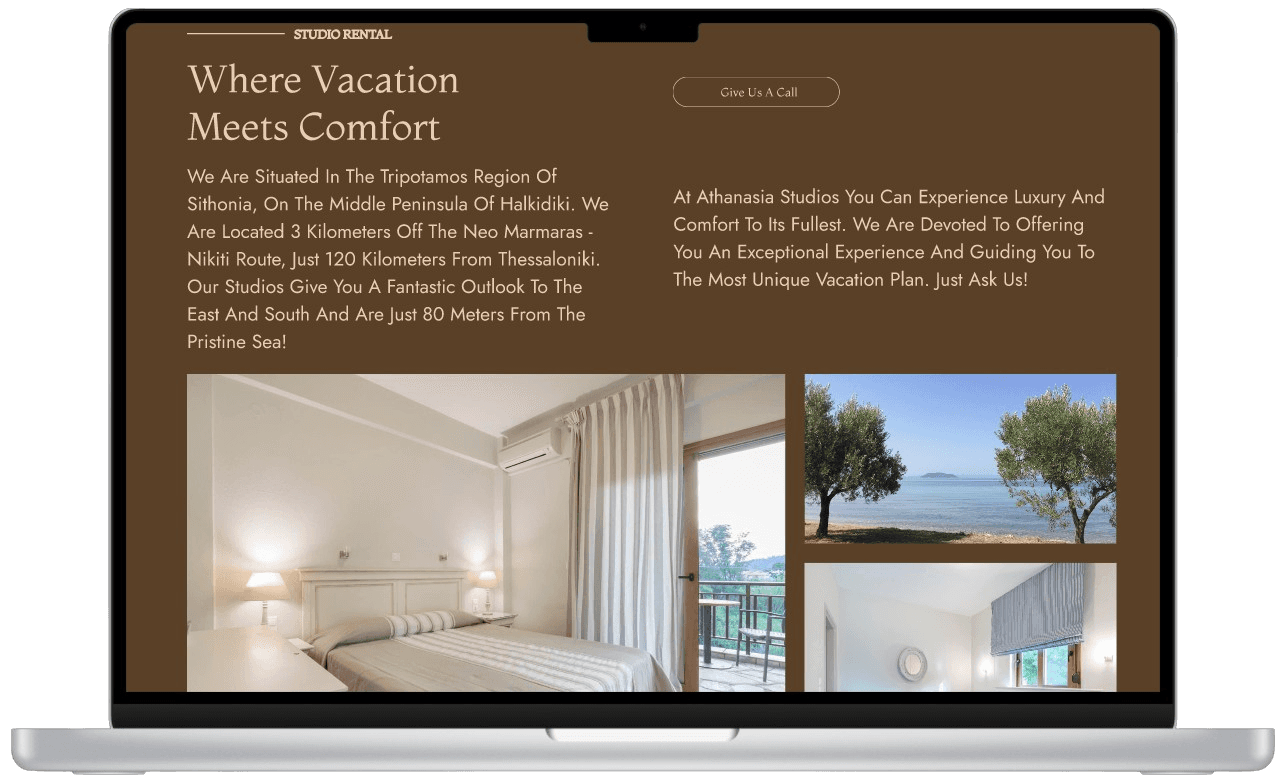
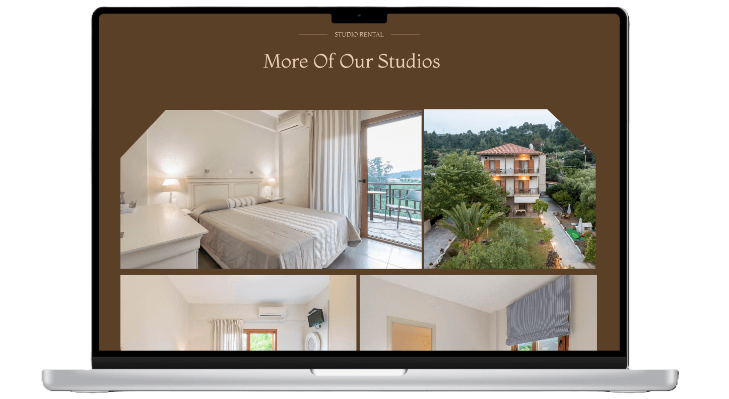
Athanasia Studios is a studio rental facility within the hospitality industry that offers a full vacation experience, including amenities such as a kitchen, barbecue stand, playground, and vacation planning services. However, the business faced a significant challenge: its outdated website did not reflect the vibrant and immersive experience it provided. The website lacked intuitive navigation, visual appeal, and seamless functionality, leading to reduced user engagement and bookings.
This case study details my UX/UI design approach to revamping Athanasia Studios’ online presence, making it more engaging, user-friendly, and aesthetically aligned with its unique hospitality offering.
(MY APPROACH)
To create an effective solution, I conducted extensive research:
User Interviews
I interviewed frequent travelers to gain insights into their booking habits. Some key findings included:
Users preferred a visually engaging interface that conveys the vacation experience.
A lack of trust signals (such as reviews and secure payment options) discouraged bookings.
Mobile accessibility was crucial, as many travelers browse and book vacations via smartphones.
Competitive Analysis
I analyzed competitor websites within the hospitality industry to identify best practices, including:
High-quality, immersive visuals to engage users.
Seamless booking flows with transparent pricing.
Interactive elements that enhance the user experience.
(VISION & INNOVATION)
Based on my research findings, I developed a strategy focused on:
Enhanced Visual Identity: Creating a Wes Anderson-inspired aesthetic with vibrant colors, unique typography, and playful animations.
Optimized User Flow: Streamlining the navigation and booking process to reduce friction.
Trust & Credibility Elements: Incorporating guest reviews, clear pricing, and secure payment options.
Mobile-First Approach: Ensuring an optimal experience across all devices.
Personalization & Engagement: Adding interactive elements and storytelling sections.
(CHALLENGES)
Throughout the redesign process, I encountered several challenges that required strategic problem-solving:
Aesthetic Cohesion & Functionality: Balancing the artistic, Wes Anderson-inspired visuals with intuitive usability and functionality.
User Flow Optimization: Ensuring that users could navigate effortlessly through the website to find relevant information and make bookings.
Trust & Credibility: Implementing design elements that reassure users about the quality and security of their stay.
Multinational Audience: Designing an interface that caters to international travelers while maintaining a cohesive brand identity.
Mobile Adaptability: Creating a responsive design that works seamlessly across various devices.
(PROBLEMS)
The previous website failed to create a compelling digital experience, leading to several user frustrations:
Difficulty in finding information: Users struggled to locate essential details such as pricing, availability, and amenities.
Lack of visual engagement: The design did not reflect the studio’s unique, Wes Anderson-inspired aesthetic, making it less appealing to potential customers.
Unclear booking process: The absence of a smooth and transparent booking system resulted in fewer conversions.
Low mobile responsiveness: The website did not adapt well to different devices, causing usability issues on mobile screens.
The goal of the redesign was to create a seamless, visually engaging, and highly functional platform that would align with user expectations and increase bookings.
(USER-CENTRIC DESIGN)
The redesign was rooted in user-centered design principles, focusing on:
User Research: Conducting interviews and surveys with frequent travelers to understand their booking behavior and preferences.
Empathy Mapping: Identifying key frustrations and motivations to craft a more intuitive experience.
Accessibility Considerations: Ensuring that the website was easy to use for individuals across different age groups and nationalities.
Iterative Testing: Refining the design through multiple rounds of testing to enhance usability and functionality.
By prioritizing user needs, the new design offered a seamless and enjoyable experience for potential guests.
(USER NEEDS)
The research phase revealed several key user needs that guided the redesign:
Simple & Efficient Booking System: Users wanted a straightforward, hassle-free booking experience.
Visually Engaging Experience: Potential guests needed high-quality images, immersive animations, and an appealing design that reflected the unique atmosphere of Athanasia Studios.
Trust & Transparency: Users sought clear information about pricing, policies, and amenities to feel confident in making a reservation.
Mobile-Friendly Navigation: A fully responsive website was crucial for users booking on the go.
By addressing these needs, the redesign enhanced user satisfaction and increased conversions.